There are a lot of online resources out there, where one could spend days trying to find the “best color palette for a family photo session.” Trust me, I have done the same thing in the past! While there are several common, general, guidelines, I feel like most things work. Everyone has their own style, and this session is about you!
Let me help you not be as stressed about your upcoming session. You can use this style guide build off of it as you see fit for your group.
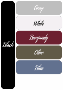
Way back in the day, everyone tried to have matching outfits. While this can still be good for a fun shot, it really isn’t that realistic for lifestyle photo sessions. Don’t get me wrong. Everyone dressed up in their buffalo plaid pajamas at Christmas, or team jerseys for game day, always makes for a good time. I enjoy photographing fun moments for great memories. For your family session, though, I would recommend everyone dress in different colors that complement each other well.
Location, location, location!
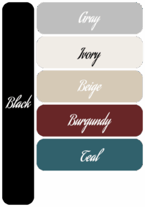
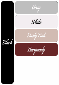
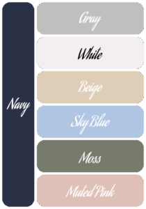
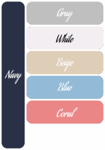
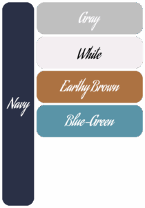
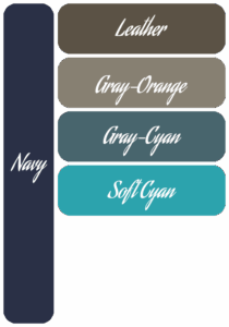
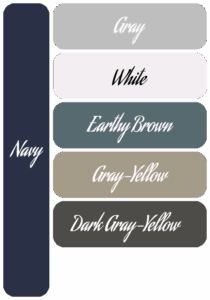
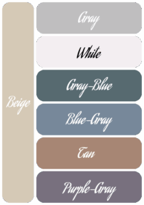
That said, the first step would be to look at your session location, then choose one or two base colors to complement it. Generally, the base color should be a neutral tone, such as black, beige, gray, navy, etc. In the art world these are sometimes called “muddy” or “muted” colors. Also try to have contrast between each person so that the colors don’t all merge together in the photo.

If your session is outdoors, during the fall, I would point you towards earth tones (think darker reds, browns, tans, olive greens, etc.). If it’s spring time, lots of green and flowers, and depending on the colors of those flowers, I would suggest lighter tones, with blues, beige, browns, grays, etc. I would also suggest that you and your spouse wear different colors, so that you don’t blend together in photos of just the two of you.
For small kids I recommend picking your adults’ outfits first, then complement their clothing to them. Your clothing serves as the anchor of your family portrait, making the biggest statement. Using complementing tones for your kids’ outfits will be easier from there.
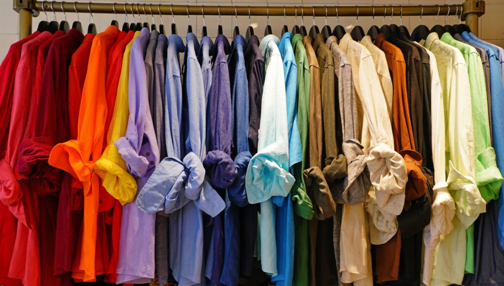
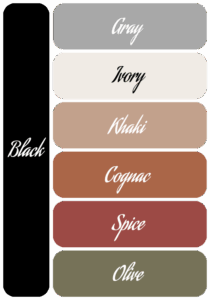
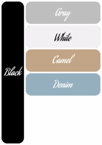
Accent colors
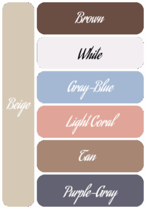
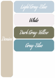
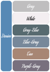
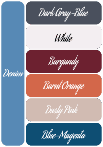
Next, pick three or four accent colors that complement the base colors. I spent quite some time researching some color palettes that look appealing together. You can see some of these color palettes below. You can click on the images to get a larger view of them.
Now, let’s talk about patterns, textures, and layers.
Layers, patterns, and textures help with dimension and showing movement. As for guidelines, it is recommended to use smaller to medium-sized patterns, but not tiny ones. Buffalo plaid and thin pin stripes are also not always great for photos. They can cause a strange effect, called moiré, on the images that is hard to remove in post processing. For textures, things like lace, linen, denim, chiffon, tulle are all great. Rule of thumb: just 1 person out of 3 should have a pattern to bring variety to the group. But, more than that makes everything too busy. Some ideas for layers are sweaters, vests, suite jackets, etc.
The most important step is to have fun!
Regardless of what you decide to wear, the goal is to have a fun and memorable experience. The smiles on your kids’ faces and the interaction between a family is my favorite part of being a photographer. I love capturing those moments of a little one looking into the face of their parent in total adoration.
If you would like to set up a time to talk, you can either use my Contact page to send an email, or schedule a call here. I look forward to hearing from you and helping you capture the next step of your journey!